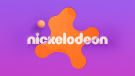
Branding & design agency Roger recently partnered with Nickelodeon, the number-one entertainment brand for kids, to collaborate on its first rebrand in 14 years. The cornerstone of the new brand identity is an update to the iconic “Splat” logo, unveiled during Nickelodeon Kids’ Choice Awards 2023. Conceived to unify the Nickelodeon brand across on-air, digital, and social, the holistic rebrand features a rounded graphic system imbued with vibrant colors honoring the network’s legacy of celebrating the inner child in everyone, regardless of age.
Roger created the look of the core brand identity and produced hundreds of tactical deliverables across on-air, out-of-home, digital, and social. Additionally, they worked with Nickelodeon's internal teams on design strategies for products, resorts, and attribution on various digital and SVOD platforms.
More recently, Nickelodeon and Roger also unveiled the rebrand work for Nickelodeon's preschool audience, with new assets rolling out last week across digital and linear and the Nick Jr. channel rebrand launching in September. The package features a playroom theme, complete with a wildly vibrant new palette and Nickelodeon’s iconic orange Splat at its center with hints of Nickelodeon’s signature green slime around the edges. The rebrand includes a new Nick Jr. logo lockup, new graphics, and animated idents.
“We have an immensely talented in-house creative and motion design team at Nickelodeon, so the bar is set very high for design and even higher for mess,” says Vincent Aricco, Senior Vice President and Global Executive Creative Director, Nickelodeon. “The team at Roger are incredible collaborators and felt like an extension of our phenomenal in-house team. They embraced the elements that make Nickelodeon a brand that continues to resonate with kids and families 40-plus years into the game – irreverent humor, a love of all things messy, and a penchant for creating larger-than-life moments that magnify the best of what it means to be a kid – and produced a modernized visual identity that is the perfect marriage of innovative design and just the right amount of weird.”
Roger Founder and Executive Creative Director Terry Lee and Creative Director Braden Wheeler led the design of the new brand system for Nickelodeon. Their goal was to create a cohesive new identity that could live, grow, and flex with Nickelodeon’s expansive creative output.
“We love a brief that asks us to tap into our weirdo kid brains,” says Wheeler. “Kids are all about trying everything out, so we wanted to make a brand that allowed for revisionism, randomness, and irreverence. That said, the design language needed consistency across every touchpoint of the Nickelodeon brand, from on-air to digital and social media to the product packaging and resort experiences, so we knew we needed a very accessible core to the visual identity.”
The live-action IDs produced by Roger tap into the idea of kids being kids in all their imaginative and messy glory. Here, Roger conducted shoots with real kids, giving them an empty canvas to paint murals, slurp noodles, or get their hands really dirty, for instance.
Roger strategically designed the new Splat using a circular grid system, which allowed for a secondary set of splat shapes to be built on the same grid to complement the hero mark with a natural cohesiveness.

The motion language used in the new brand calls back to Nickelodeon’s classic animated style with a blend of traditional cel animation and modern 3D design. Bold and clean typography is layered on top, satisfying the client’s vision for a contemporary look and feel that honors its legacy as an iconic kids’ network.
Built around Nickelodeon’s signature orange, the new brand palette enters fresh territory with complementary gradients of purples, yellows, and pinks. Meanwhile, the typography taps into the brand’s irreverent DNA. Roger chose ROC Grotesk for its subtle irregularity and paired it with Neue Plak, which created contrast with its more condensed style. With the extensive style options within both font families, the brand would have a wide range of opportunities for evolution in the future.
“We aimed to infuse a sense of imagination and exploration into every deliverable and design choice in a quite literal sense, with elements reinventing themselves in real-time,” explains Wheeler. “It was a tightrope balance between eclectic and cohesive, but the modularity built into the system gives Nickelodeon the flexibility to play in their sandbox and build upon the brand for years to come as new IPs and initiatives are introduced. Flexibility was always at the forefront of our thinking.”
“As a kid, Nickelodeon was my go-to, and that went a long way in shaping my sense of humor and expanding my creativity,” concludes Lee. “From Rugrats to SpongeBob and Big Nate, they continue pushing the boundaries of kids’ entertainment. We’ve been working with Nickelodeon since our early days as a studio. There’s a shorthand that only comes with a longstanding relationship, and that ease of communication kept us in lockstep while brainstorming the new identity. It truly was a collaboration that couldn’t have happened without the strength of their in-house team. The Nick crew is top-notch, and that gave us full confidence that we could push the boundaries both creatively and technically. Above all... IT. WAS. SO. MUCH. FUN.”
With the design work created by Roger as its foundation, Nickelodeon’s rebrand campaign also features five brand films that depict the Splat as a gateway to surprising experiences, each featuring “Easter eggs" Nick kids of all ages will love; a new lineup of network IDs featuring Nickelodeon's beloved IP that will debut throughout 2023, and an on the ground extension that will bring Slime-filled “We Make Fun” parties to 400 schools across the country as a “portal to summer.”
Client: Nickelodeon
EVP, Global Kids & Family Marketing: Sabrina Caluori
SVP, Global Creative: Vincent Aricco
Executive Producer: Danielle Jotham
SVP, Design & Motion: Michael Waldron
Branding & Design Agency: Roger
Executive Creative Director: Terence Lee
Creative Director: Braden Wheeler
Executive Producer: Josh Libitsky
Head of Production: Anne Pendola
Line Producer: Christian Kendrick
Post Producer: Tara Danna
Art Director: Rob Modini
Technical Director: Alex Van Dyne
Editor: Patrick Nagy

Adland® is a commercial-laden heaven and hell for advertising addicts around the world.
This advertising publication was founded in 1996, built on beer and bravery, Adland® now boasts the largest super bowl commercials collection in the world.
Adland® survives on your donations alone. You can help us out by buying us a Ko-Fi. Adland® works best in Brave browser