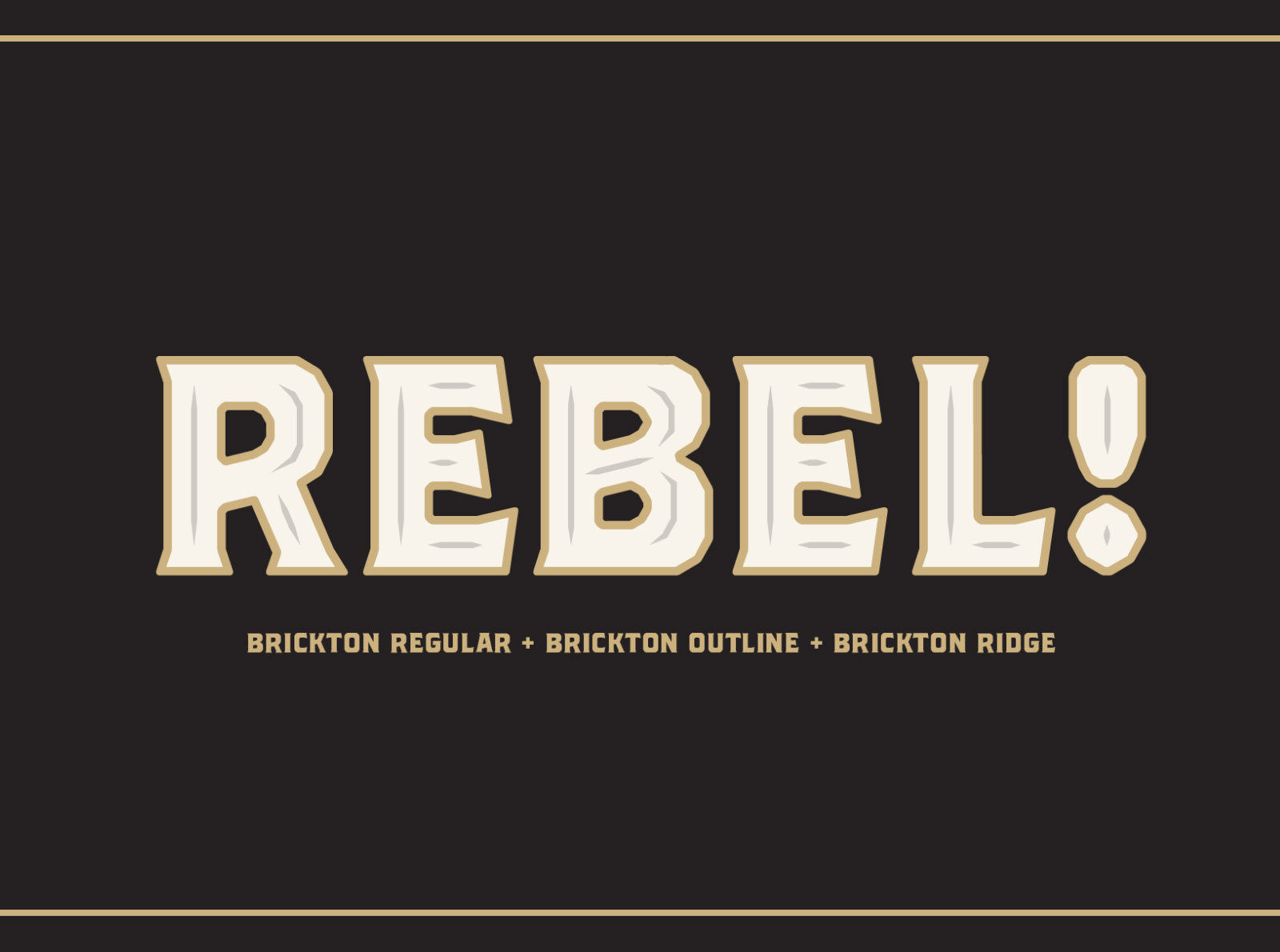
Brickton might seem like a domineering font that spells things out with aplomb. It has bold characters and pointy serifs, but upon closer inspection, there are curves, corners and the arches are chamfered.
Adding to its versatility, Brickton has a layered font system that lets you superimpose styles. Use Brickton Regular and Brickton Lines on top of each other to create a design with text that has an inline style to it. Or use Brickton Ridge for another type of line style.

Adland: In making this font, were you looking to solve a specific problem that you've had?
Daniel Feldt: This started out as a custom font as per request from a client who was looking for a bold display font for a packaging project.
This was maybe two years ago and the project never got any further than the initial sketching phase.

Adland: What visually inspired you for this?
Daniel Feldt: The obvious inspiration is a typeface called Brothers by John Downer. The proportions are quite similar but Brickton is a little bit thinner and has a smoother outer edge on arcs, shoulders e t c as well as a sloping cross strokes and a bit different serifs and angles. Other inspirations came from the original client request that had some refernce photos of vintage packaging. A couple of classic Swedish beer labels as Gränges and Mariestads also server as inspiration. I wanted something that would look great on a can or a bottle or as a label on pasta packaging. I always referred to it as my “pasta font” before starting actual work on it. To also add value and a bit uniqueness to Brickton, make it more of its own thing, I created a couple of styles that can be used together.

Adland: This font can be layered to change how it looks, how did you come up with this concept?
Daniel Feldt: Oh, that’s not a unique concept that was created for this project. Layer fonts and color fonts is a thing that’s been around for a while. I’m using an app called Glyphs to create my typefaces and there you easily create layer fonts by adding masters and instances. You just need to make sure that all the masters share metrics so the different styles align when you superimpose them. With just a few different styles you give the user lots of combinations and options.
Adland: How long did it take from idea to finish to do this?
Daniel Feldt: Hard to say since it’s been in my mind and in different forms on the computer for a few years. But since I decided to expand the sketches to a useable font with different styles I’d say a couple of months perhaps.
Adland: Have you used it yourself in a project somewhere?
Daniel Feldt: Nope, not yet. I’ve spent a couple of days creating promos and mock designs with it, that’s always a fun part of the project.
Adland: Have you seen anyone else use it yet?
Daniel Feldt: It’s just out now, since a day or two. So, not yet. :)


I built this website. From scratch. Including the servers.
Adland® is a commercial-laden heaven and hell for advertising addicts around the world.
This advertising publication was founded in 1996, built on beer and bravery, Adland® now boasts the largest super bowl commercials collection in the world.
Adland® survives on your donations alone. You can help us out by buying us a Ko-Fi. Adland® works best in Brave browser